One of the preliminary steps in writing a good machine learning algorithm is to visualise the training data and almost always, datasets (especially after pre-processing) contain a lot of features, sometimes thousands. As we know, it is impossible for humans to visualise a mapping of 1000 dimensions. This is where dimensionality reduction algorithms such as t-SNE come into play.
What is t-SNE?
t-SNE stands for t-Distributed Stochastic Neighbour Embedding. It was developed by Laurens van der Maatens and Geoffrey Hinton in 2008. It is an award winning, unsupervised nonlinear algorithm that embeds high-dimensional data into two or three dimensions. So, basically it gives an intuition or a sense of how the high dimensional data would look like and how it is distributed by giving a 2D or 3D mapping of it.
How t-SNE works
t-SNE considers each pair of points and constructs a conditional probability distribution for all such pairs. The conditional probability is a measure of the similarity between each pair of points. It is higher for more similar points and vice-versa. This probability is calculated via a parameter called perplexity which describes the number of immediate neighbours to be considered for getting the similarity measures.
Now, this was all for the high dimensional space. In the corresponding low dimensional counterpart, the algorithm will initially create a random distribution of probabilities. The most crucial part of the algorithm is how it minimises the difference between the high dimensional and low dimensional probabilities for each pair. Due to this, similar points will be closer to each other in the 2D or 3D representation. What makes t-SNE stand out, is the shift of focus from separating dissimilar points to bringing similar points closer in the 2D representation. Due to the pairwise comparison, t-SNE has a time-complexity of O(N^2) where N is the number of datapoints.
Why is t-SNE better?
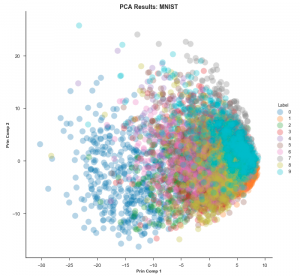
To understand why t-SNE is so useful, one needs to know how it is different when compared to other dimension reduction techniques, most importantly PCA. Principal Component Analysis (PCA) is a linear method that gives more importance to separating points as much as possible whereas t-SNE lays heavy emphasis on bringing similar points as close as possible. This is why in t-SNE plots, one often (but not always) sees many clusters marking clear separations among dissimilar points. Let’s see the plots generated by the two techniques for the MNIST dataset. (MNIST is a dataset comprising thousands of grayscale 28×28 images of handwritten digits from 0 to 9. One converts each image into a data point with 784 dimensions and then plots all these points in 2D). The PCA embedding would look like this:

The datapoints are all over the place and it is extremely hard to differentiate them. This is known as the ‘grouping problem’.
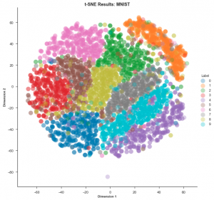
Now let’s look at the t-SNE mapping of the same dataset:

t-SNE is clearly the winner in this case. It is much easier to visualise the data using this embedding.
PCA is a linear algorithm. It will not be able to interpret complex polynomial (non-linear) relationships among features. On the other hand, t-SNE is based on probability distributions and can find structures within the data. Thus, if the data is unlabelled, PCA would fare poorly whereas t-SNE would not.
Drawbacks of t-SNE
As with literally every other machine learning algorithm, t-SNE comes with its own share of drawbacks.
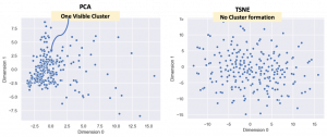
As mentioned earlier, t-SNE is non-linear and tries to make clusters from the datapoints but, the important thing is that it is not a clustering algorithm! Let’s use the Marvel Character dataset to demonstrate this. This dataset has 185 features and each Marvel character is assigned a value for each feature. So, once again the PCA and t-SNE embeddings (185D to 2D) are compared.

Why did this happen? Well, the reason that t-SNE does not have any cluster is because there aren’t too many superheroes with simlar features. To be more specific, the data is sparse. Of course, in this specific case the clustering does not really matter. What is to be noted however, is that when one is dealing with sparse datasets one might expect clustering for good data exploration but there may not be any in the t-SNE visualization.
t-SNE has a quadratic time complexity; so, its applicability is limited to data sets with only a few thousand input objects; beyond that, learning becomes too slow to be practical (and the memory requirements become too large). On low performance CPUs, t-SNE would take hours. Often, we use GPUs while implementing it. t-SNE embeddings ‘oversimplify’ the data especially when one is dealing with more than 1000 dimensions. So, t-SNE is strictly used for data visualization and exploration purposes only. Unlike PCA, one cannot make any detailed interpretations from the data. Also, one has to use the whole algorithm again if they want to add the test data to the training (initial) data.
However, there are several ways to overcome these shortcomings. It is highly recommended to use another dimension reduction method (e.g. PCA for dense data or TruncatedSVD for sparse data) to reduce the number of dimensions to a reasonable amount if the number of features is very high. This way, t-SNE finds its application in a wide variety of problems including Medical Image Processing, Natural Language Processing, Cancer Research and Climate Control.
For a beginner in Machine Learning and Data Science, t-SNE should definitely be one of the first algorithms in the bucket list.
Happy training 🙂
Sources:
1. colah.github.io/posts/2014-10-Visualizing-MNIST/
2. lvdmaaten.github.io/tsne
3. en.wikipedia.org/wiki/T-distributed_stochastic_neighbor_embedding срочно взять займ онлайн без проверок


